In our custom work, we have defined hundreds of combinations – and what we've found is that mock-ups are essential to finding colors that work in concert with one another. With Beautiful Combinations we share some suggested palettes. You may find a space in your project for one of these palettes – or use our DKC Color Cards layered with your fabrics, woods and tiles, to visualize your spaces fully painted. Even small swatches of your materials, layered together in a corner can help you visualize the way an entire room will feel.

Bird Song
With two blue-grays and four off-pink sand hues, the dynamics of this palette can be shifted to different and pleasing effects for a wide variety of spaces.

SHINING STONE
Juxtapositions of close valued colors emphasize one another’s chromatic nuances. Pink-white with cream-white, against gray-white, offset by lavender-white blur to atmospheric effect. Interchangeable in spaces, our Shining Stones exchange tints with one another according to the shifting light.

Maison de Verre

NICKLEBY'S PLIGHT
Combine the off-black ink of the printed page with paper's faded gray to create a grounded welcome for the neutral stone colors. Ink recedes against light warm limestone, and when braced by cooler gray trim can lead to one of many potential expressions of this palette.

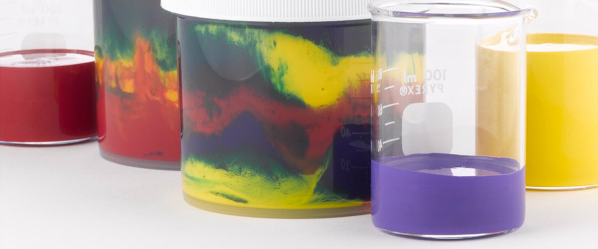
TEA & SYMPATHY
Violet-brown energizes the green underpinning of the golden yellow – and pushes the gray toward its blue polarity. A pink-violet white further coaxes the dark brown into the shadows. Many dramatic schemes are possible by exploring variables of amount and juxtaposition.