Taxes and shipping calculated at checkout
Color News
Jun 25, 2018
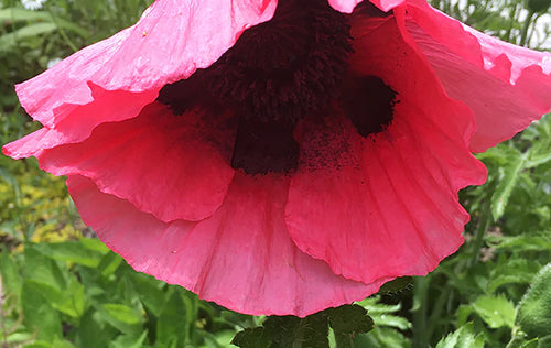
Color: Poppy Pink
Complementary colors, when seen overlapping, make each other appear brighter.
We observe this in our garden as the crenelated edges of June Poppy blossoms float against their leafy green foliage and light each other up.
SHOP POPPY PINK | Shop all Colors of the Month

Apr 30, 2018
Color: Baby Beluga
We sometimes connect with colors in unlikely contexts. We advise closer looks at familiar scenes for delightful surprises.
Combining the glow of yellow’s inherent light with nostalgic pink undertones, our toy whale suggests old-fashioned cream.
SHOP BABY BELUGA | Shop all Colors of the Month
Mar 21, 2018
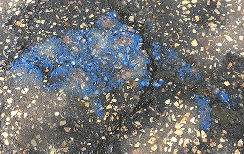
Color: Blue Fish
Colors under water appear soaked with brightness. The brilliance of the swarming fish inspired us to make our March blue with the saturated intensity of an azure twilight.
SHOP BLUE FISH | Shop all Colors of the Month
Feb 21, 2018
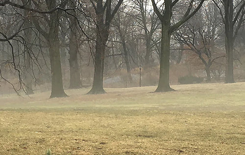
Color: Misty Grass
Atmospheric mist slips in and out of our vision, yet it expresses our February's silvery hue. It should remind us that we can create and experience color sensations in the seemingly invisible atmospheres of our living spaces.
SHOP MISTY GRASS | Shop all Colors of the Month
Jan 24, 2018
Color: John Adams Green
We love painted floors in a country house. Their patterns of wear harmonize with the outdoors. John Adams suggested Thomas Jefferson paint a dark green over his narrow wood planks on the floors of his Monticello entry. It still remains. We have made a version that is deep, but neutral.
SHOP JOHN ADAMS GREEN | Shop all Colors of the Month
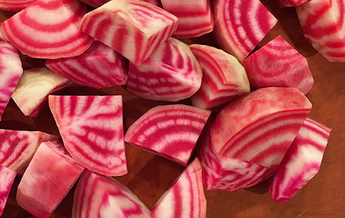
Dec 19, 2017
Color: Patty's Chioggia Beets
The season's association with candy cane actually "colors" our recognition of December's Chioggia Beets and their Fuchsia striping. We often identify colors with what we think they are, instead of their purely visual sensations.
SHOP PATTY'S CHIOGGIA BEETS | Shop all Colors of the Month
Nov 17, 2017
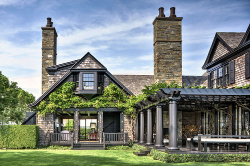
A Renovation Expert's Brooklyn Brownstone
Our Color Collection colors are featured in this November 2017 issue of Architectural Digest Online for this beautiful three-story Brooklyn brownstone. Special thanks to Dan DiClerico, Rebecca Paley and Bolee Architects.
Read the article here.
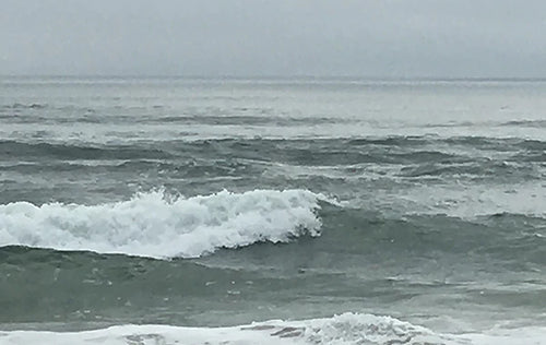
Nov 08, 2017
Color: Winter Sea
The infinite play of light within roiling surf has inspired this month's Ocean Green. Our color sensations churn, as well, when seeing radiant energy's reverberations between air, water and sand.
SHOP WINTER SEA | Shop all Colors of the Month
Oct 26, 2017
White: Palette, Prism, Possibility
Join us for Initiatives in Arts and Culture's 19th Annual Fashion & Design Conference: "White: Palette, Prism, Possibility" November 10-11, 2017 Donald Kaufman will open the Conference and share his thoughts on White, its mysteries, its riddles and its parallels between our dress and our rooms. Friday, November 10, 8:45 a.m. “When faced with 150 shades of white... finding the perfect hue seems like an impossible...
Oct 10, 2017
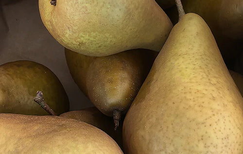
Color: Golden Green
Our visual system creates gold by mixing sensations of green & red.
The warm golden brown of October pears has been created with the same pigment dynamic. It inspired this Color of the Month which lends a room luminosity without garishness.
SHOP GOLDEN GREEN | Shop all Colors of the Month
Sep 05, 2017
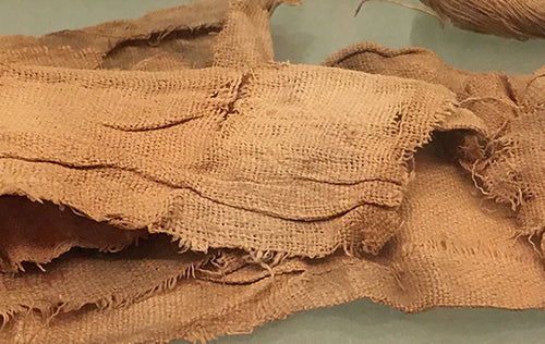
Color: Mummy Brown
We’ve always been intrigued by the long-term practice of grinding up mummies to make a dark umber artist pigment.
Our September color mimics the linen wrapping of the deceased body. A classic neutral brown in a medium value suitable for endless decorating opportunities.
SHOP MUMMY BROWN | Shop all Colors of the Month
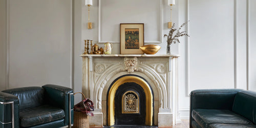
Aug 09, 2017
Contrast of Dark and Light: Custom Colors for Farmhouse Estate in Mecox Bay
Our custom colors are featured in this August 2017 issue of The Corcoran Group's Inhabit Magazine for this beautiful waterfront Mecox Bay estate. Special thanks to Daniel Romauldez Architects and Katherine McCoy.
“We perceive brightness not only by the level of the light in a room but also by the contrast…the brain interprets the strong contrast seen in these rooms as brightness.”